Saturday, December 19, 2015
First paper(s) accepted, and thesis proposal proposal proposed!
Saturday, May 2, 2015
Roads Greenery Buildings
What is your neighborhood made of?
What's good? Depends on you, I guess, but I think this tool shows how places with more buildings tend to be more approachable and interesting, while green space often just makes things farther apart.
Monday, April 27, 2015
Thinking about metrics
But, I've got reason to assume, based on what GiveWell's done so far, that at least some of the Open Phil people are thinking about it in this broad sense.
And metrics aren't all bad! I think about WalkScore, which is limited and flawed, but is still a pretty solid and useful indicator of how nice it is to live in a place. And really, the thing is, we're often making decisions by metrics anyway, and often those metrics are suuuper flawed. Like GDP. So if I'm reading about a Social Progress Index on TED, sure, it might be a TED blowhard with another half-assed idea, but it doesn't have to be that good. I'd love to start talking about SPI instead of GDP, not because it's great, but because it's better.
Saturday, April 25, 2015
CHI 2015: some particularly interesting things
I ... want to write about so many things here. I'll try to just write about 10ish papers.
Talks I Enjoyed Because They Describe Interesting Phenomena Well
Your Money's No Good Here: The Elimination of Cash Payment on London Buses, Gary Pritchard, John Vines, Patrick Olivier. No cash means more work for customers, different work for drivers, drivers have to decide whether someone "might be vulnerable", loss of some social interaction, and the inability to gift. Among other ups and downs. But there is a curious side point: money is a technology too; why is that the assumed baseline?
A Muddle of Models of Motivation For Using Peer to Peer Economy Systems, Victoria Bellotti, Alexander Ambard, Daniel Turner, Christina Gassmann, Kamila Demkova, John M. Carroll. First of all, this was a top notch talk, flying through these theories but in a way I could still follow. Second, I like how they integrate a lot of these theories together. Or at least reference them all in the same place.
From Third to Surveilled Place: The Mobile in Irish Pubs, Norman Makoto Su, Lulu Wang. Phones change the pub dynamic in a few ways: you can look up quick facts instead of bantering about what the answer is (which is more fun anyway), you can use it for entertainment, but also everyone knows that if they do something silly (that is typically safe in a pub) you might be photographed and put on Facebook and that silly thing out of context will be embarrassing.
Talks I Enjoyed Because They Might Relate More Directly To My Work On Social Media, Urban Technology, Connecting People, and Maps
Modeling Ideology and Predicting Policy Change with Social Media: Case of Same-Sex Marriage, Amy X. Zhang, Scott Counts. They took tweets about same sex marriage in each state, and also compiled a list of same sex marriage bills that they were trying to pass in the same time. They could see correlations between words that indicate certain values (like "authority" or "fairness") and bills passing or failing. They could predict whether the laws would pass up to 87% accurately, where polls (which are slow etc) could only predict 70%.
"Everyone is Talking about it!": A Distributed Approach to Urban Voting Technology and Visualizations, Lisa Koeman, Vaiva Kalnikaite, Yvonne Rogers. They wanted to democratize data gathering and surface the data they gathered in multiple places. So they put a little thing with 3 buttons in shops along this road, and asked questions each day like "do you feel safe around here?", and then spray-chalked the % of people who said each thing on the chalk outside each store. Lots of super interesting results. Made me rethink the form of whatever I end up doing; not necessarily a thing-on-a-screen.
Making social matching context-aware - Design Concepts and Open Challenges, Julia M. Mayer, Starr Roxanne Hiltz, Quentin Jones. Sometimes you want to say "hey, you and you should meet." But there are a lot of factors that determine whether you should or not. This paper lays them all out pretty well. Some are individual, like maybe you are really busy right now. Some are temporal or spatial: in a train station, you're likely running for your train, not meeting randos. Some depend on how similar you are, relative to everyone else around.
An Evaluation of Interactive Map Comparison Techniques, Maria-Jesus Lobo. So if you have two layers on a map and you want to be able to see them both (to compare or whatever) what do you do? Answer: use a blended lens or a semi-transparent layer, not a slider or two maps next to each other.
Talks I Enjoyed Because Some Of My Friends Do Amazing Design Research
Making Multiple Uses of the Obscura 1C Digital Camera: Reflecting on the Design, Production, Packaging, and Distribution of a Counterfunctional Device, James Pierce, Eric Paulos. It's a camera encased in concrete except the button and the lens. So you can take thousands of photos, but if you ever want to get them out, you have to break the thing with a hammer. This is awesome: like Twitter or Snapchat, it puts a limit on a digital thing, and comes up with something really compelling in the process. Also, James packaged and sold it as a consumer device, on craigslist and in stores. This makes us think about it differently than a typical HCI study with an IRB etc., so it can generate new forms of knowledge. This paper and talk are pretty much the best.
Understanding Long-Term Interactions with a Slow Technology: An Investigation of Experiences with FutureMe, Will Odom. First, it's an interesting tool with a neat bunch of users: they send emails to their future selves. (or to someone else in the future.) Up to 60 years. And it's really deep; people send heavy stuff through this. So it's cool to hear about it, and it's cool to see "slow technology" actually deployed in action.
Talks I Wish I Saw But I Like The Papers
Can An Algorithm Know the "Real You": Understanding People's Reactions to Hyper-personal Analytics Systems. Jeffrey Warshaw, Tara Matthews, Steve Whittaker, Chris Kau, Mateo Bengualid, Barton A. Smith. They draw a line between personalized (you like basketball) and hyper-personalized (your big 5 personality profile is ...) People find these hyper-personalized systems creepily accurate, more than humans, and they won't even correct them when they "make mistakes".
How Good is 85%? A Survey Tool to Connect Classifier Evaluation to Acceptability of Accuracy, Matt Kay, Shwetak Patel, Julie Kientz. This paper addresses maybe my number one gripe with basically every ubicomp system, which is that it starts to recognize some thing with 85% accuracy, and then everyone says "ok, publish it" regardless of whether that accuracy (or precision or recall or whatever) is actually good enough to do anything in the real world. (if my self-driving car could see stop signs with 94% recall, I would not be in that car.)
Oh And Can We Talk About:
How good PSY was? Just the humblest dude, telling us about how he doesn't know social media, how one of his managers was like "we should upload Gangnam Style to Youtube" and he said "why?" Or how right now he's just trying not to be trying so hard, or about how when he performs everyone is just waiting for him to go "oppa Gangnam style" and that's ok? It was a simple talk, fun, and inspiring. Felt like the perfect end of the week.
How good Seoul was? Lots of fun sightseeing including a market of weird fish, temples all over, wonderful neighborhoods and cafes (my other blog will soon have a post about exactly that), super clean and safe, super easy, friendly people, lots of fun, and pretty cheap too, really. I... would hurry back to Korea, and encourage others to do the same, for work or fun.
Saturday, March 28, 2015
PhD Grind part 0.8 of N: picking a school
Sometimes people ask, why did you pick CMU? In order, it was 1. students, 2. profs, 3. outcomes, 4. everything else was fine. I think that decision order is pretty ok, but maybe profs should be tied for #1, not sure.
But! In more detail:
1. Students: I just felt pretty well at home with the students here. Hard to say why. Ok, not much more detail here, other than to say: this is important! Both the existing students, and the other incoming ones, will be working with you for many years. Maybe hanging out outside school too, depending on the place. (we're pretty social at CMU). You'll probably spend more time with them than the professors. You get a half a minute to get to know them at open houses, so that's frustrating, but if you find you really like (or dislike) the students at one place in particular, take that into account.
2. Professors: best case, you find an advisor. Second best case, you find a group of potential advisors where you'd be happy to be advised by any of them. (more info on this decision) If you don't have either of those, don't go to that place. Your advisor relationship is suuuuper important. More important than a typical boss. They will not only be your boss (so they can make your life easy or hard) but they will also be some inspiration, introduce you to other people, etc. So make sure you have an advisor idea before you sign the form.
One side note: if one place has your #1 top choice advisor, and another place has your #2 choice, go with #1, obviously. But if one place has your #1 top choice, and the other place has #2, #3, and #4, and you've never worked directly with any of them before, I'd say go with the 2-3-4 place. There's a lot of randomness that you don't figure out until you work with someone, and someone who seems perfect might just for whatever reason end up not a perfect match. So in that second case, go with the #2 advisor, and you've always got 3 and 4 if 2 doesn't work out.
3. Outcomes: notice what the graduating students are doing. If they're all getting the kind of sweet jobs you want to do, that's a good sign. If half are doing startups, and you want to do a startup, great! If they're all going to industry jobs, and you want to be a prof, not so great. If 2/3 of them are dropping out and sitting at home wallowing in depression, probably not so great either.
4. Everything else: these will probably not factor into your decision, but look out in case they do. City, stipend, classes, quals, teaching, office space, etc. Usually these will all be fine: the city is ok, the stipend is about the same, you have to take ~8-10 classes, you have to pass through some hazing ritual such as quals or comm talks or extra classes, you have to teach 2 classes, your office is a desk in some depressing basement, etc. These are all fine. But this is an area where there can be red flags: if you don't have a guaranteed stipend, if you have to teach every semester, if the city is super expensive and difficult to live in (lookin at you, Stanford) or in the middle of nowhere and depressing to you, the hazing/quals makes half the students quit, etc. If there are any red flags, they should factor into your decision as much as the above 3 points. Otherwise, don't worry about these things, they're fine.
So! If you've considered all these, go with your gut then, and you'll do fine. Also, if any current prospective students end up reading this and want to talk more, find my email (or twitter), drop me a line.
Friday, March 6, 2015
Not really research, but fun: Swot Perderder
So I made a twitter bot that generates these:
I got a list of ~500 foods (harder than it may seem), used the CMU pronouncing dictionary to translate word -> phonemes, then mapped each phoneme to a randomly chosen letter that either matched it closely (s -> s) or not so closely (s -> zh).
That's all for now. It'd be neat to make it interactive someday, or make it a reddit bot or something, because the world needs more of these misspelled foods.
Also, it'd be neat to see which of these are favorited/retweeted/etc more, because then we could refine the rules to make them even funnier. Yes.
Edit: code's here: https://github.com/dantasse/swot_perderder
Thursday, February 19, 2015
Monday, February 9, 2015
CheeseHoods
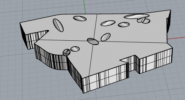
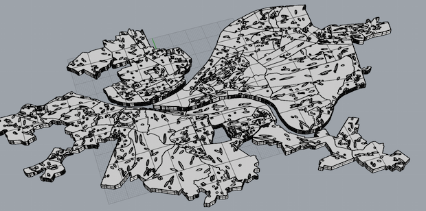
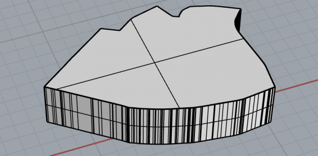
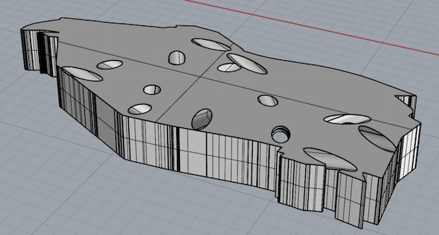
CheeseHoods are blocks that look like Pittsburgh neighborhoods. They have holes in them like Swiss cheese. The denser the neighborhood is, in terms of dwellings per acre, the fewer holes it has.
Why neighborhood blocks? I thought it'd be fun to have a jigsaw puzzle of Pittsburgh, really. Plus, just as playing with world maps helps kids learn country names, playing with your city might help you learn more about it.
Why the holes? Density is important. Jane Jacobs wrote about it as one of the four most important characteristics in creating vibrant neighborhoods. Dwelling density, in particular, is quite important; human density can just indicate overcrowding, but dwelling density indicates vitality. I was interested to explore what density looks and feels like in 3D. Putting holes through a neighborhood seemed like an easy way to do so. Plus, it gives the least dense neighborhoods a rather icky pock-marked feel, while thriving denser ones are pleasantly solid, so this gives a really visceral feel to "density is good".
Pictures just Bloomfield, above.
Below, all of Pittsburgh.

 Central Oakland is a shining example of density, but you can see right through Greenfield (below).
 Code's on github. Not embedding it here because there's a lot. I used some tools from another repo (get_dwelling_densities.py) plus some census data to calculate dwelling density for each neighborhood, then computed a json file of all the borders of each neighborhood and random hole locations (nghd_to_shape.py), then finally slurped those into a last script that created objects in Rhino (rhino_script.py).
Play with 'em:
Bloomfield by dantasse on Sketchfab
Pittsburgh by dantasse on Sketchfab


